
Side Panel
Use the side panel when the product should remain available while users move between pages and tabs.
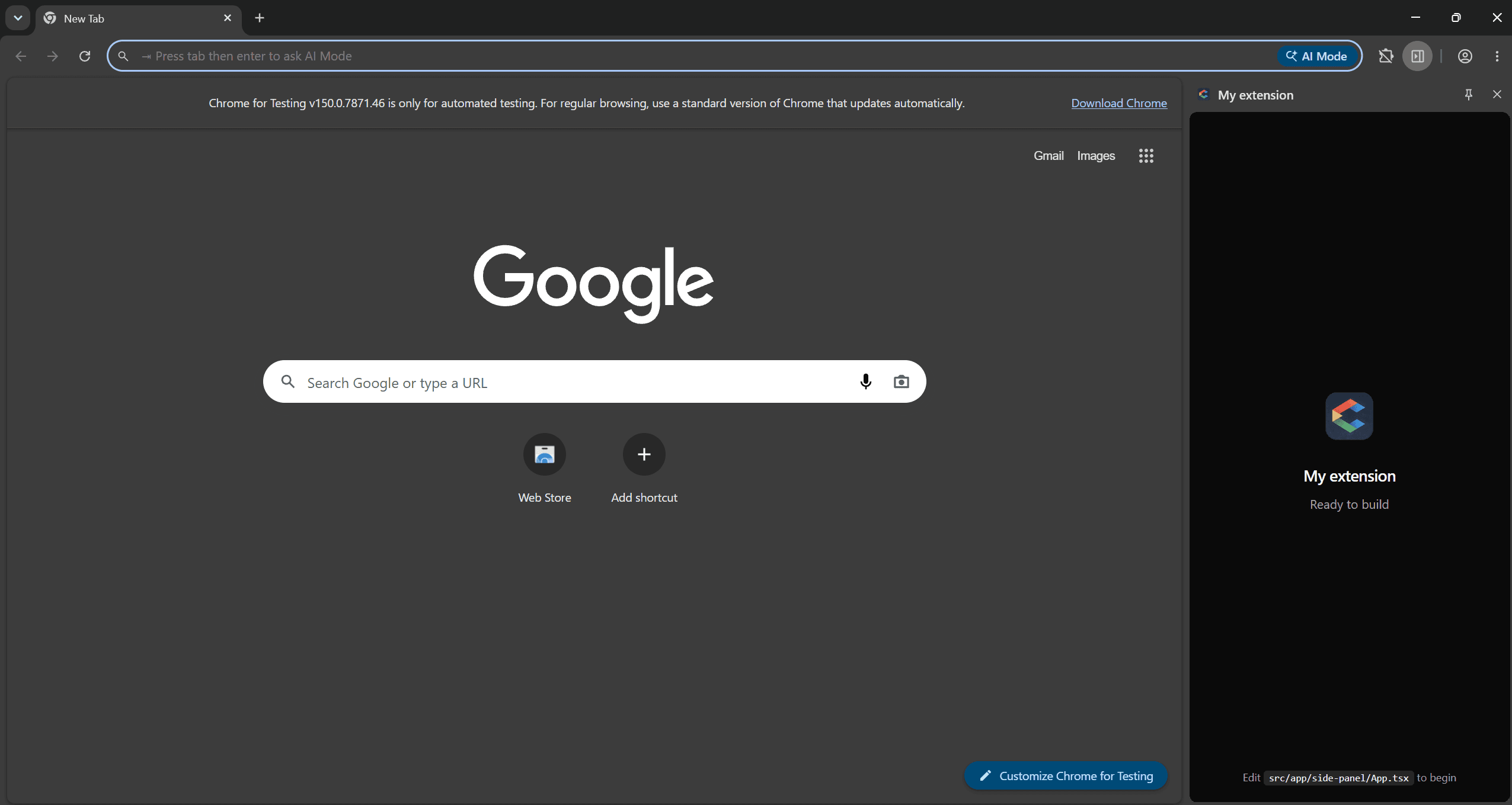
Add a side panel
Add Side Panel from Settings > Surfaces. ChromeShip creates the React entry, adds the permission and manifest path, and prepares the background behavior required by Chrome.
Edit the side panel
Open src/app/side-panel/App.tsx:
import { Button } from "@/components/ui/button";
import { Card, CardContent, CardHeader, CardTitle } from "@/components/ui/card";

export default function SidePanelApp() {
  return (
    <div className="flex h-screen flex-col overflow-hidden p-4">
      <h1 className="text-xl font-semibold">My Panel</h1>
      <Card className="mt-4 flex-1">
        <CardHeader>
          <CardTitle>Content</CardTitle>
        </CardHeader>
        <CardContent>
          <p className="text-sm text-muted-foreground">
            Your panel body goes here. It stays open as users navigate.
          </p>
        </CardContent>
      </Card>
    </div>
  );
}
Set as entry surface
Select Side Panel as the entry surface in Settings > General. ChromeShip keeps the toolbar action, manifest, and background bootstrap aligned.
Width
The side panel is typically 320–420px wide. Design flexible layouts that work across that range. Use h-screen overflow-hidden to constrain the panel to its viewport.
Persistence
Do not rely on component state surviving every browser transition. Persist durable data with Chrome storage and use messaging for commands sent to background or content scripts.
Next
See how to persist state with storage helpers. Pair with content scripts to inject UI into pages. Or add background messaging for cross-surface communication.