
Popup
Use the toolbar popup for a focused action users can complete quickly without leaving the current page.
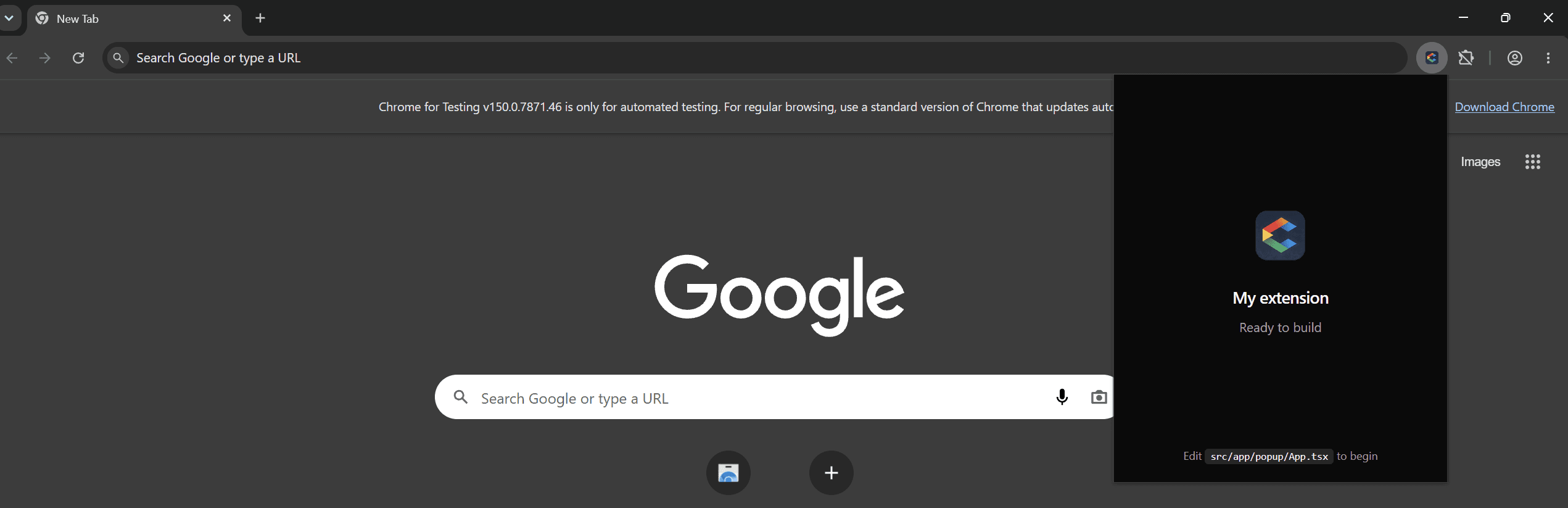
Add a popup
In Settings → Surfaces, click Popup. ChromeShip creates src/app/popup/App.tsx and popup.html.
Edit the popup
Open src/app/popup/App.tsx. Build your popup with React, Tailwind, and shadcn:
import { Button } from "@/components/ui/button";
import { Input } from "@/components/ui/input";

export default function PopupApp() {
  return (
    <div className="w-80 p-4">
      <h1 className="text-lg font-semibold">My Extension</h1>
      <p className="mt-2 text-sm text-muted-foreground">
        Quick actions go here.
      </p>
      <Input className="mt-4" placeholder="Search..." />
      <Button className="mt-3 w-full">Run</Button>
    </div>
  );
}
Width
The browser controls popup dimensions. Design for 320–400px. Use w-80 or w-96 on your root element.
Live reload
Save the file and watch the build in the runtime logs. Because Chrome closes a popup when it loses focus, reopen it after a rebuild to see the latest version.
Authentication
When Supabase is enabled, the shared auth adapter keeps the popup session synchronized with the other extension surfaces.
Next
Pair the popup with an options page for settings, or switch to a side panel for a persistent interface. Need to talk to the background? Use the messaging helpers.